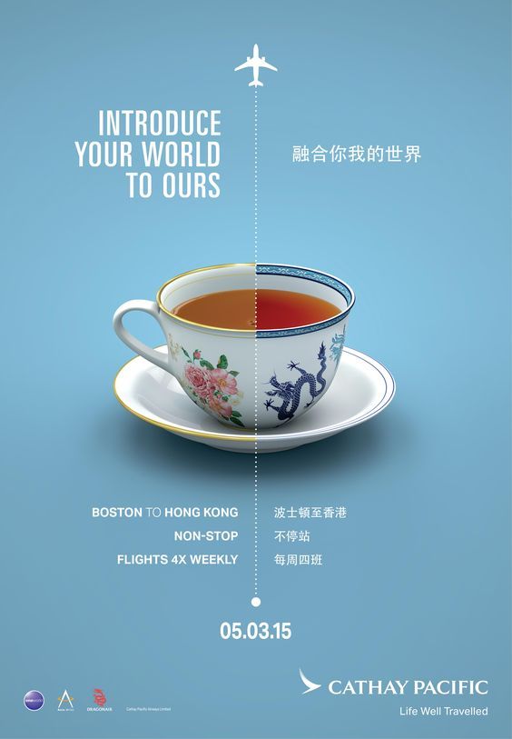
This advertisement was created for Cathay Pacific Airline (designer unknown). It was created in 2015 when this airline had a new non-stop flight from Boston to Hong-Kong.
Contrast
I can see that contrast is almost the main focus here, and it is represented by the dotted line going straight down the middle separating the two sides. I think that the main contrast that you would notice first is the teacup. It appears as one uniform shape but made from different colored cups. Each side of the cup also has different patterns and actual tea inside. I think that the next biggest thing would be the contrast in language. On the left, we can see the English language. On the right, we can see the Chinese language. Overall, there is a lot of contrast as the ad is quite literally separating everything in half.

Repetition
Next, we have repetition. For this concept I wanted to focus on the text. Although different languages, the same message is written twice in each location. So, for every English word stated, the Chinese translation of the same message is on the right. Also, for the smaller words under the cup, the spacing in between phrases stays the same. This makes it look clean and organized.
Alignment
The alignment is very interesting here. On the left side, there is right alignment, and on the right side, there is left alignment. I think that the main reason is because it creates a straight line against the dotted line, and makes it look clean. But, it is also interesting how the alignment is opposite because then we could say that this is another observation for the contrast concept.
Proximity
For proximity, I was looking at the language translations. Each phrase is directly next to the phrase that is its translation. Their proximity indicates the relation that they are saying the exact same thing. So, even if we can speak one of the languages, but not the other, we can assume that they are saying the same thing.
Color
For the background, the colors are very simple. There is blue for the main background and white for the text. I think white was a good choice for the text because it will obviously stand out best over the blue. I also think this combination was chosen to represent the colors of the sky and clouds. Without reading the ad, we could probably tell from the colors and the airplane symbol what it may be about. I also put lines near the cups because this is where we see the most colors. From the tea colors, to the pattern colors, there is a ton of variety. I think the main reason for a very different color palette on each side is to relate to cultural things perhaps. It is showing how you are able to travel from one country to the next. One far away place to the next.

Conclusion
Overall, I feel that this design is very well done. I think that the more I looked at each section, the more things I could point out for each concept. I think it does a very good job of mixing all of the concepts to create this idea that the countries from airport to airport are very far away and different. But, this flight has “connected” them in a way both by literal non-stop flights, but also other things too. Also, the main quote in the ad, “Introduce Your World To Ours,” suggests that these differences should not keep us from sharing our cultures with places around the world.
