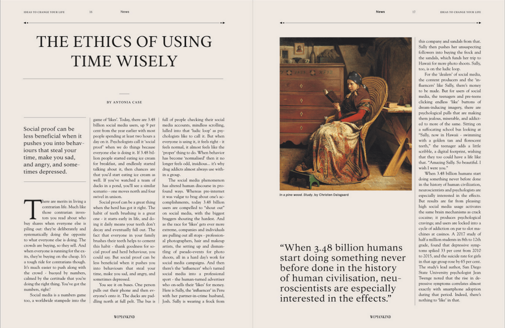
I found this image of a magazine spread from Womankind Magazine and it was created by a studio called Patten. Patten is a freelance design studio located in Spain with a goal of developing creative content. Also, Womankind Magazine is an “advertising-free women’s magazine on self, identity, and meaning in today’s society.”


Typeface Category
The main typeface of the entire piece is Oldstyle. You can see that there is a diagonal stress on the letter “O” and “C” as well as the others. You can also see the bracketing on the curved parts of the tops of each letter. It is all uppercase so we cannot see any slants, but we can see the other features. There is also present thick/thin transitioning. In the typeface for the magazine’s logo we see a Modern typeface. I drew vertical lines to show how there is vertical stress in this case. There is also no bracketing on the tops of the letters. Once again, it is all uppercase, so we cannot look for the serifs that would occur on a lowercase letter.

Typeface Contrast
I would say the main elements that makes these two contrasting would be the fact that the stress is different. One is diagonal and one is vertical. There is also a big difference between the thick/thin transitioning of the letters. For a Modern typeface, this transition is much more drastic than compared to the Oldstyle. The bracketing is also a big distinguisher because Modern doesn’t have any bracketing, while Oldstyle does. This is mainly because of the history of each typeface in which Oldstyle represents the slant of a pen while in hand and Modern does not.
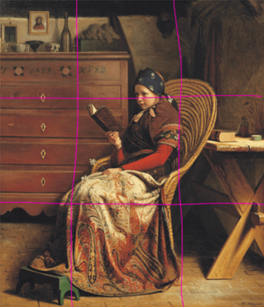
Photography
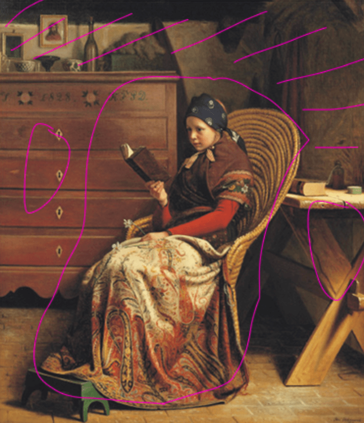
I would say that this image follows the Rule of Thirds and Depth of Field. In the first image I drew out a grid to represent the Rule of Thirds, and it seems to line up fairly well. I think to make it better the girl would have needed to be more to right, but overall it seems to sit on the three corners of that middle square. I would also say that Depth of Field is apparent. The girl and her chair are the focus point in the foreground. Then, we have the table and the dresser and the objects in the middleground that fall behind the girl but don’t seem super far away. Lastly, I put lines in the very back to show the background. This would be the wall, the objects on the dresser, and anything that is hanging on the wall.
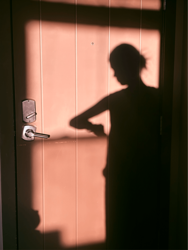
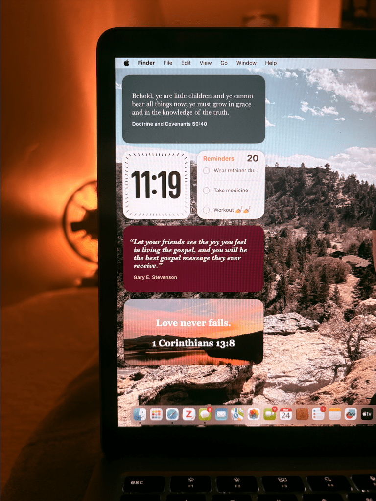
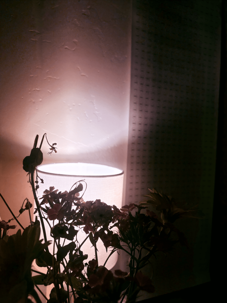
My photos mimic the original because they all have that sort of cozy vibe and they all have a representation of time. The first is my shadow of me checking my watch which not only shows me physically checking the time, but also the light is because of the sun setting or the time of day almost being done. The second is showing the widget on my computer that has a clock (even though the computer already shows it in the top right). The last one you can see a missionary countdown calendar in the background. They also use the same concepts. The Rule of Thirds is in play because each main section of the image is imagined to be on those right side line intersections. They also follow the Field of Depth as some objects are very close to the camera while others are much further.
Conclusion
Overall, I really liked dissecting the design of this magazine spread. I think that the typeface wasn’t as contrasting as it could have been, but I tried my best to still compare. I think that if the larger headings on the page had a very different typeface, then that contrast would have been more clear. I did really like the image they used as well. It definitely contributed to the overall vibe I was getting from the piece itself.