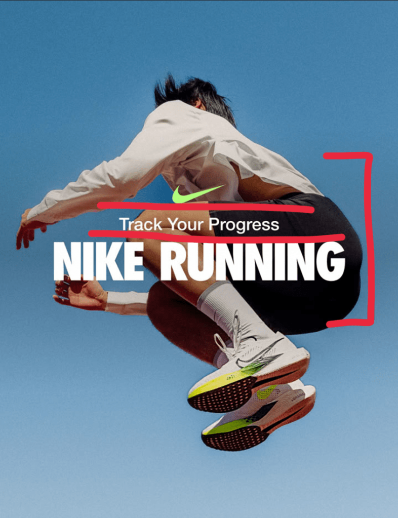
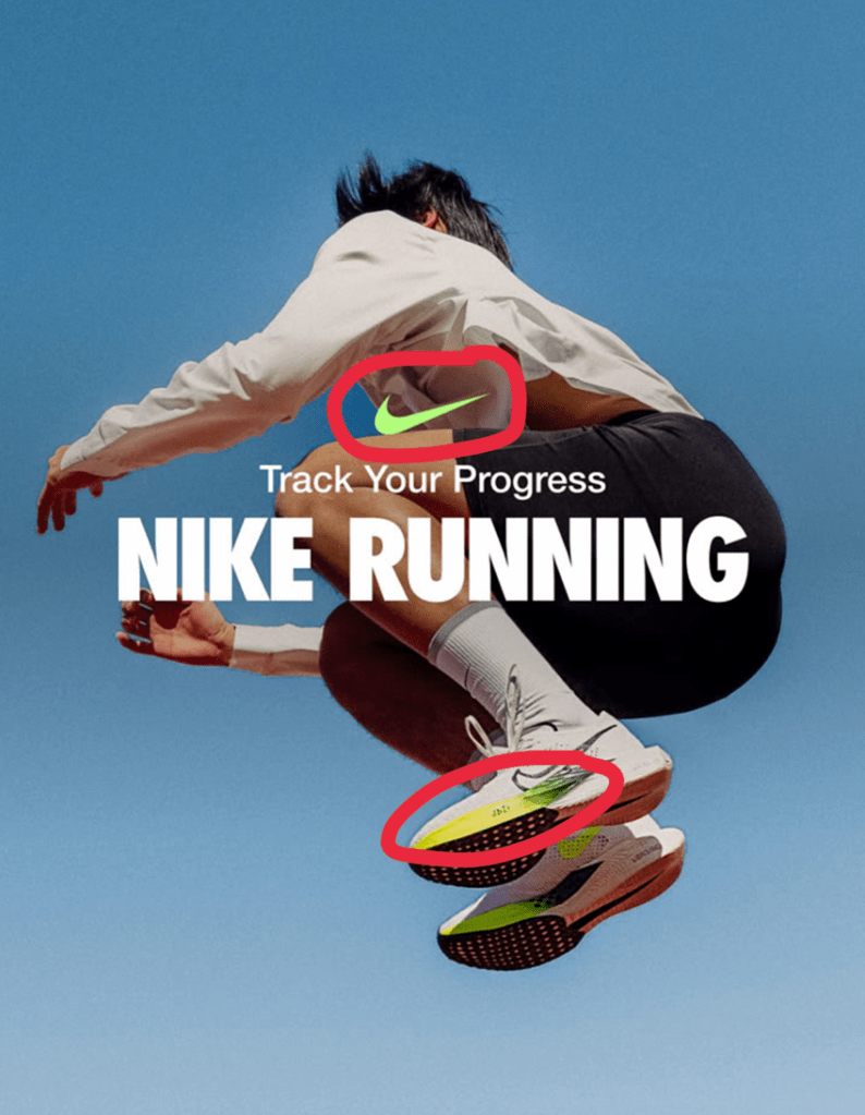
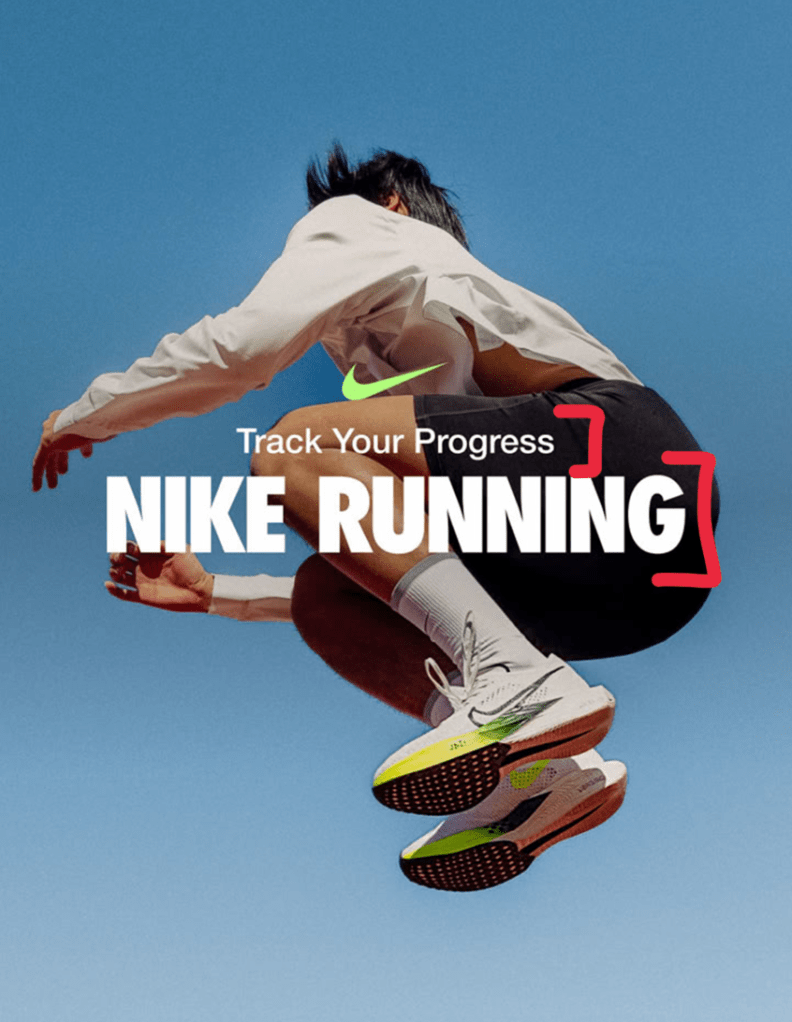
Original Ad
Nike running ad that was found on pinterest; designer unknown. The design is specifically for the pair of running shoes. It is very simple with only one subject right in the middle. The neon green logo is matching the bottom of the shoes. The message is simple and to the point, and the image doesn’t feel crowded.

New Ad

Design
The main characteristic of the design I noticed was the proximity. The logo, tagline, and the brand name are all very close together. The main purpose of this is obviously showing connection of ideas, but I think another benefit to this placement is bringing your eyes to focus on the middle right away. I also think that if the words were too spread out then everything would feel too crowded.
Color
The main color theme I noticed was the logo matching the bottom of the shoe. It is also very bright so it stands out right away. Also, the rest of the ad being white and black keeps a simple theme going.
Typography
The first typography feature I noticed was the different fonts that were used. The bottom font is much thicker and is possibly bolded compared to the first line of words. The second thing I noticed was that the first line has lowercase lettering and the second is entirely capitalized. This brings focus to the brand right away.
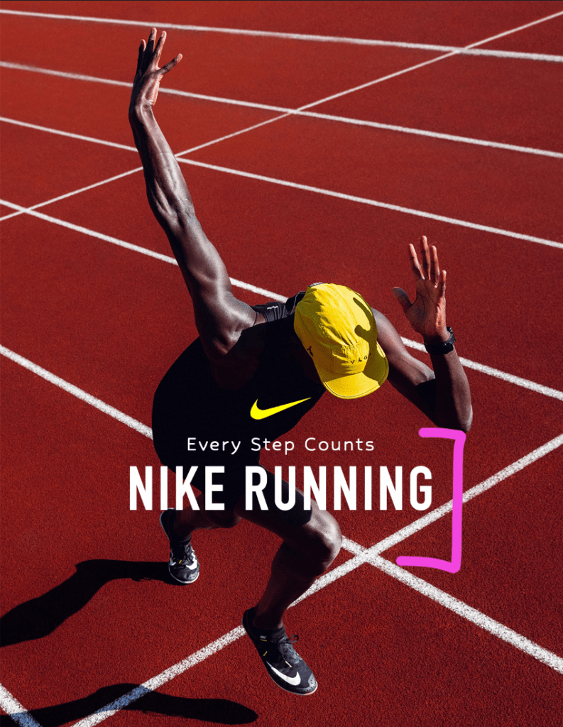
Design
I wanted to focus on repetition in my new ad. I know that it wasn’t purposeful because I didn’t add it, however it stuck out when I was looking for a picture to use. The lines on the track just gives an illusion of even repetition in the background.
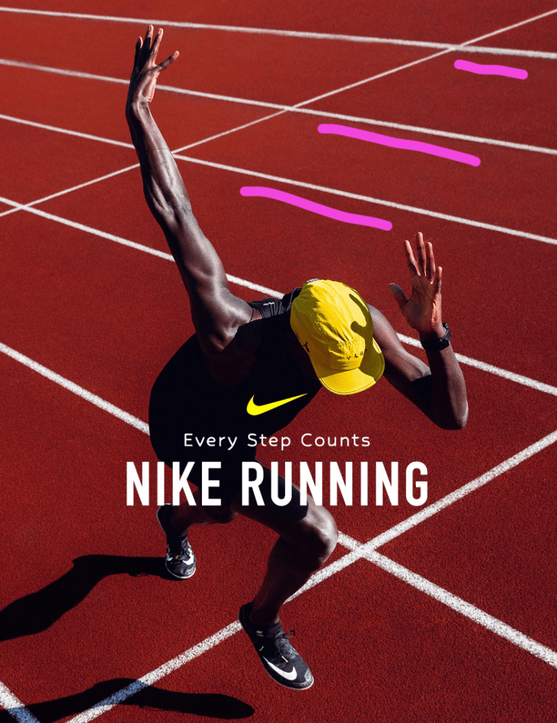
Color
The man’s bright yellow hat immediately stuck out to me while I was choosing an image for this ad. I knew that I wanted to make the logo match it so that there was a pop of color that stood out to the black clothing and red track.

Typography
For my ad I made sure to keep the theme of one line as normal and the other being fully capitalized. I also made sure they were distinct from one another.
Conclusion
I feel that this ad can be used for the same campaign as the original because it follows the same concepts. Both have a main subject as the focus while wearing the promoted running shoes. Both have very minimal text right in the middle with a colored logo above that matches a bright color. It is simplistic and it is motivating to those who are in to running.